Power BI Dashboard vs Power BI Report: Understanding The Difference

Is data presentation an art or science? One may argue that it has aspects of both. While there are metrics used to showcase the performance and growth of an organization or an individual, the presentation needs creativity to make it appealing and easy to comprehend complex information. This is why there is a need for solutions such as Power BI Reports and Power BI Dashboards.
Power BI Reports and Power BI Dashboards are creative and easy to use. These solutions enable data to be presented in a visually appealing way. Anything that is visually appealing will be easy to remember as well. A study found out that an individual can retain information up to 65% if presented in charts, graphs etc. Instead of tabular data.
Let us now understand what Power BI Reports & Power BI Dashboards really are and how they are different from one other.
Power BI Reports
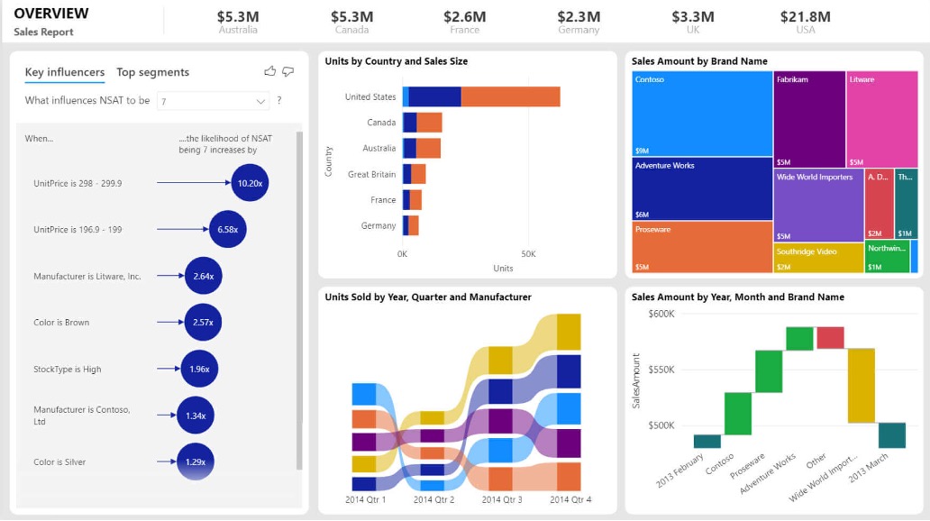
Power BI Reports present data from multiple points of view. It showcases insights and findings using different visual elements such as charts, graphs from a single dataset. Reports provide highly detailed information from the dataset. Power BI Reports can be sliced and diced easily to understand the data from different dimensions. Multiple visual elements can be used in Power BI Reports.

Source: Power BI Report
Power BI Dashboards
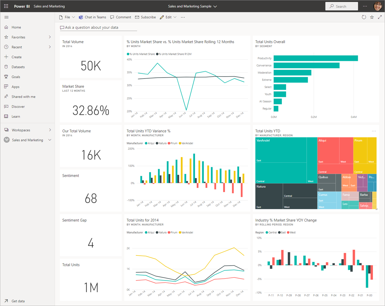
Power BI Dashboard is a collection of multiple Power BI reports or collection of visuals referring different datasets pinned on the Power BI dashboard. The Power BI Dashboard is also referred to as canvas having multiple tiles.

Source: Power BI Dashboard
Comparing Power BI Reports Vs Dashboards
We have briefly explained what Power BI Reports and Power BI Dashboards are. Now we will have a deeper look into the differences between the two, to know what makes each of them unique and valuable solutions for data visualization.
Purpose:
The purpose of a Power BI Dashboard is to provide data at a quick glance. It provides a summary of the key performance indicators (KPIs) from multiple datasets.
Power BI Reports are created with the objective of providing detailed insights into a specific dataset. It decodes and elaborates data from multiple viewpoints in an enticing way.
Source:
Power BI Dashboards are built with multiple datasets that are co-related in one or more ways with one another.
Power BI Reports are built on a single set of data tables. It is not related to any other datasets.
Modification of Visuals:
The visual elements of tiles on the Power BI Dashboard are limited in nature. Customization in terms of changing the size of visuals, placement of tiles and so on can be reflected, but modifications such as change in visual elements from pie chart to bar or column graph for a dataset will not be reflected on the dashboard.
Power BI Reports, on the other hand, can be easily customized. Users can choose a variety of visual elements and customize the reports as per their requirements.
Pages:
As it only provides a summary of the dataset, Power BI Dashboard consists of only one scrollable Canvas.
Since Power BI Reports are detailed in nature, they can be created in single or multiple pages.
Alerts:
Using Power BI Dashboard, you can set a criteria to send alerts after a data point meets certain numbers like Targets achieved. These alerts can be sent via email as well.
Power BI Reports does not have the feature to send alerts to the owners of the reports.
Desktop Support:
Power BI Dashboards cannot be created using Power BI Desktop but only through Power BI Services.
Power BI Reports can be created through Power BI Desktop as well as Power BI Services.
User Interactivity:
Power BI Dashboards enable users to pin tiles on the canvas and therefore, allow users limited interaction with the dashboards.
Power BI Reports can be filtered, sliced, and diced the way users wants to design a report and therefore enable user interactivity.
Which One to Choose?
Now, we have understood the differences between Power BI Dashboards and Power BI Reports, you may still be not sure which one is best suited for your business.
Interactive visuals referring single dataset which will help user understand the data well and will be able to take decisive actions. In such a case, Power BI reports are suggested.
For Power BI dashboards, you can take the glimpse of data from different datasets with less interactive visuals.
But since both of them are quite unique solutions, they should be seen as complementary solution to one another rather than a competitive one. The reason for that is they are not absolute substitutes to one another but, the strengths of both can be combined to enhance the data visualization.
If you are interested to know more about Power BI Dashboards and Power BI Reports, click here to connect with us.
