How to Design Story with Data?

As we all know – when we tell story along with facts and figures, its more meaningful. Somewhere I had read – We believe in god but trust in Data.
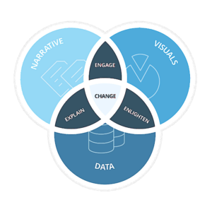
As per Brent Dykes author of “Effective Data Storytelling”, there are three pillars of effective Data Storytelling, viz Data, Narrative and Visuals.\

Effective Data Storytelling Venn Diagram
Explain with Narrative & Data:
Narrative and Data will help your organization to interpret the data and why is this specific piece of information is important. It helps to explain what is happening with the dataset.
Enlighten with Visuals & Data:
Visuals and Data allow the audience to be enlightened with the various insights and patterns. It helps to give raw data a visual appeal that can help in figuring out emerging trends or any outliers.
Engage with Narrative & Visuals:
Narrative and Visuals will drive engagement. It helps in bridging the connection with the organization.
So how do I build Dashboards and visuals to creating a story?
Dashboard is a story told with data and visuals/charts. Each paragraph is represented by one widget and sequence of widgets placed in certain order makes it story.
We at Intellify have developed templates to design a story and here it is how it evolves,
1. What story you want to tell? E.g. Year passed by, Particular team’s performance etc.
2. List of questions you want your story to answer – here is a trick for this. Please keep your questions simple and straight forward at the beginning. Future versions of the questions can be more complex.
We not just tell stories using data, but we help you design stories and create it along to take actions.
Car Dashboard Story

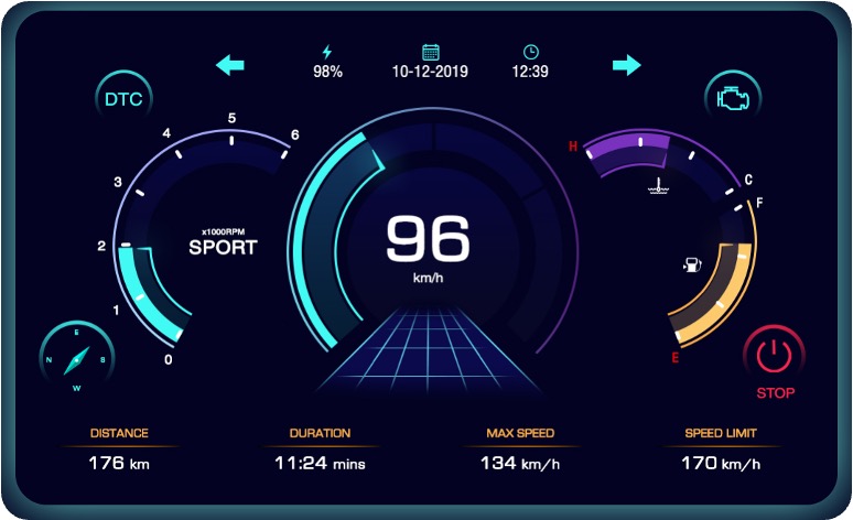
Each Chart/Visual/icon is a data point and is conveying some information. Speedometer, RPM, Fuel Indicator, Handbrake etc. are all widgets. This dashboard gives out the entire health status of the car in one go. You do not need to scroll through for information while driving, look.
Let us now understand the few key design principles of Dashboard:
Placement:
Ever wondered why the speedometer and RPM are right in the centre and rest of the widgets are placed on the side. This is because they are the most important data points on the car dashboard. The speed at which car is running and the Number of Revolutions of the engine crankshaft are crucial as it keeps you updated about the vehicle’s movement.
Then comes the Fuel Gauge and Engine Temperature indicator placed on the left and right sides. This is placed in such a way to make the driver aware of the condition of the engine and does the car have enough fuel for your journey.
Colour:
Each widget on the dashboard has a different colour. The reason for this is that each widget has a different priority and based on that color is decided. Red being the brightest and white being the least bright colour, each widget is assigned the colour based on its importance.
Timing:
Widgets on the car dashboard light up only when there is some alert or warning. The timing of the alert/warning is crucial and needs to capture driver’s attention.
Space Taken:
Speedometer, RPM, Fuel Gauge and Engine temperature take up the maximum amount of space. This is done because the driver must focus on these four widgets all the time and therefore, it takes the maximum space on Car Dashboard.
Data Visualization for Organization
Having a data visualization dashboard for your organization exactly helps in solving the issue of monitoring areas of improvement. Identifying areas where your organization needs to improve is a story that can be told easily if data visualization solutions are adopted by the organization.
There is no need to panic for the organization if few metrics indicate a downward trend in an organization’s growth. Frequent monitoring through data visualization dashboards can easily solve this issue for your firm by taking the desired action.
As explained using the car dashboard example, it is also important to understand what metric should be given the highest amount of priority. There are tons of metric that an organization needs to look but understanding which one would make huge amount of difference for the organization’s growth is the key.
Conclusion
Now the millionaire dollar question – how can your organization have a data visualization solution and what are the steps to implement it?
Each dashboard tells a unique story. A KPI dashboard has the narrative of historical performance, a finance dashboard tells the story about how well equipped the firm is in terms of liquid assets. Every pie chart, bar chart, line graph etc. has a unique story to tell about your organization’s performance.
At Intellify, we believe in the power of visualization and therefore have developed several different templates that can be promptly implemented as per your needs. Depending on the story you want to narrate, we can develop a solution that matches your needs. Click here to get in touch with our storytellers and know how you can tell your story to the world with data visualization.
