
Designing Executive Dashboards That Drive Decisions
A Practical Framework for Building Dashboards That Actually Get Used
Table of Content
Why Most Dashboards Get Ignored
1. Define the Question Before You Touch the Data
2. Choose Metrics with Intention
3. Build the Analytical Layer — Context is Everything
4. Match the Visual to the Question
5. Remove Everything That Does Not Serve the Reader
Why Most Dashboards Get Ignored ?
Hours go into building a dashboard data correct, charts polished then it’s shared once and rarely opened again. It had the data; it lacked direction.
The problem is rarely the data it’s almost always the deeper design of purpose, structure, and narrative. A dashboard that doesn’t tell you what to do next is just an expensive spreadsheet.
Six principles separate dashboards people use from dashboards people ignore.
An executive dashboard is not a compressed report; it is a decision tool that shows what changed, why it matters, and what requires action.
The two dashboards below carry identical data. One makes the insight immediate. The other makes the reader work for it.
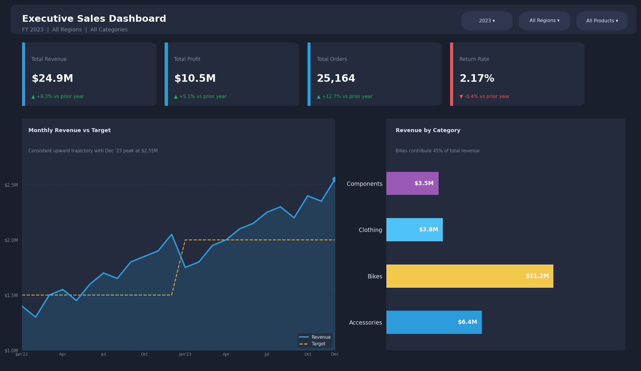
Figure 1 — Clean: dark theme, semantic colours, no gridlines, value labels inside bars, clear axis space
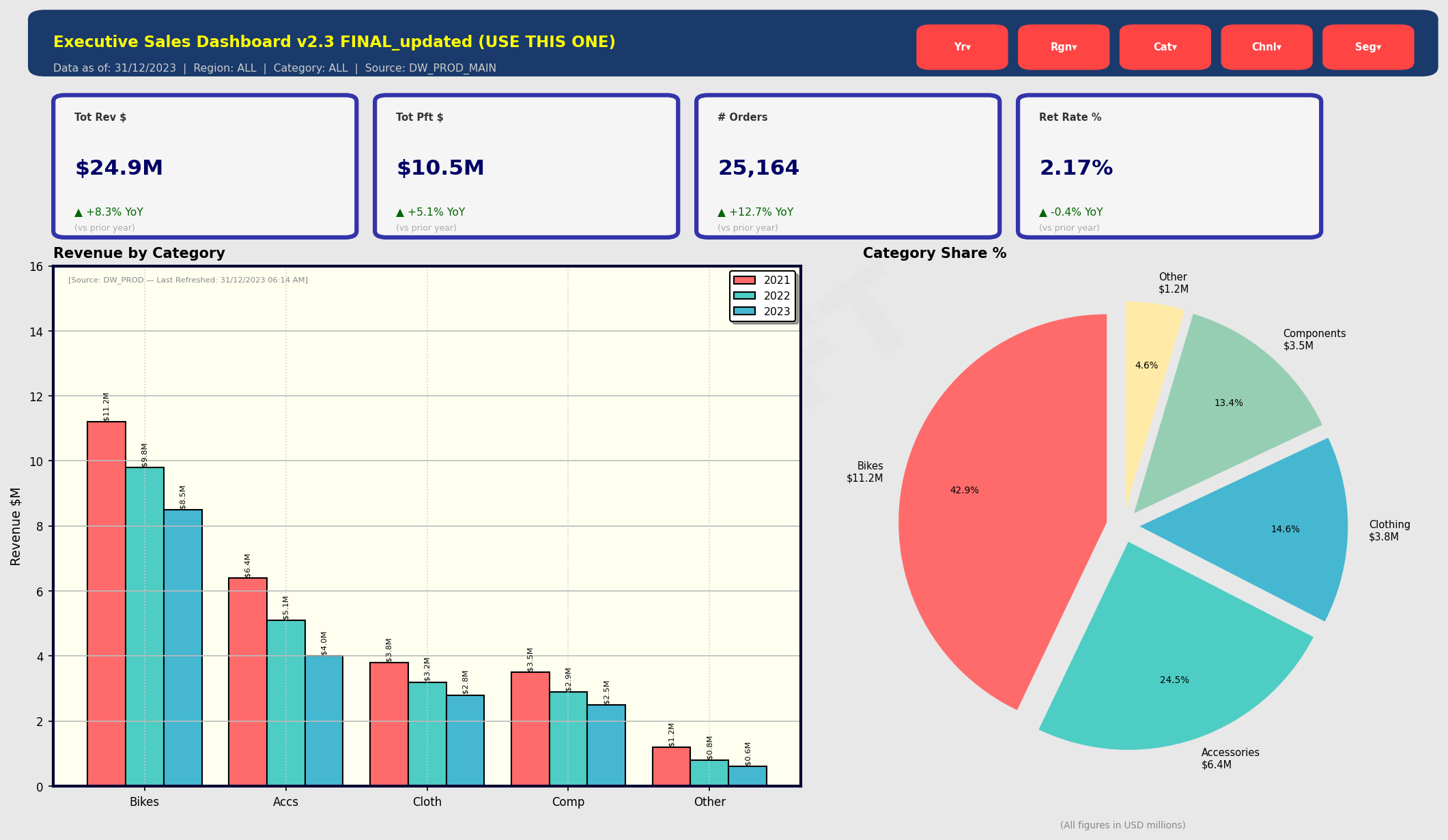
Figure 2 — Cluttered: inconsistent colours, grouped bars, a pie chart for category comparison, titles that describe rather than direct
The Framework at a Glance
Each principle below builds on the one before it. The most common mistake: jumping to visuals before the first two are resolved. A beautiful chart built on the wrong metric is a well-designed lie.
| Principle | What It Achieves |
|---|---|
| 1 · Define the Question First | Grounds the dashboard in the decision it must support, not the data available |
| 2 · Choose Metrics with Intention | Ensures every number on screen answers a question that bears on the decision |
| 3 · Build the Analytical Layer | Shows what the number is compared with, and why the difference matters |
| 4 · Match Visual to Question | Removes the cognitive tax of reading the wrong chart type |
| 5 · Remove What Does Not Serve | Recovers the attention that clutter steals and focuses it on the decision |
| 6 · Write the Story, Not the Label | Transforms a report that describes into one that tells the reader what’s next |
1. Define the Question Before You Touch the Data
Resist the instinct to open the tool and start building. The question isn’t “What data do I have?” but “What decision does this dashboard need to support?” different starting points, different outputs.
A decision-first dashboard has a clear audience and scope; a data-first one accumulates metrics nobody can find when they need them.
Before building, answer two questions: who will use this, and what action should it make easier?
2. Choose Metrics with Intention
Every metric on a dashboard claims it matters. Including everything means prioritising nothing.
Map each metric to a business question and decision; if neither is clear, it doesn’t belong on the dashboard.
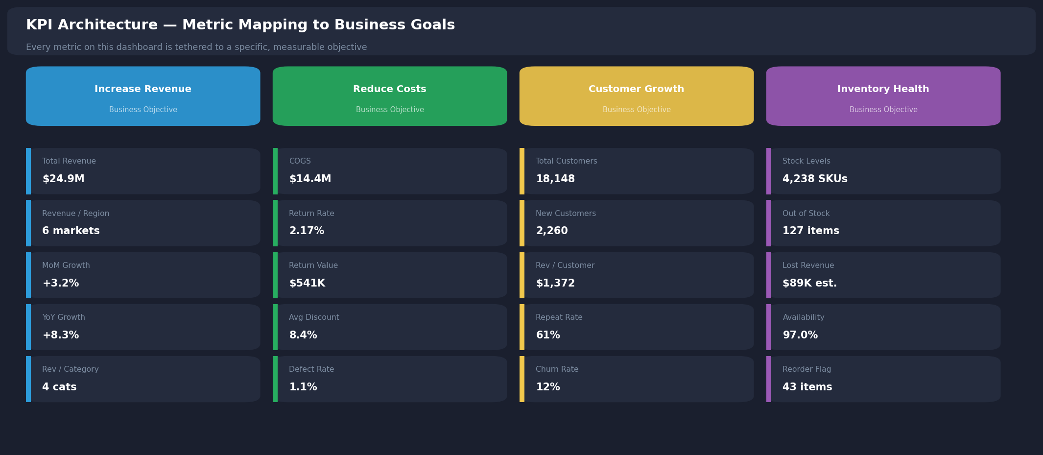
Figure 3 — Metric mapping: every KPI tied to a business objective anything else shouldn’t be on the main canvas.
3. Build the Analytical Layer – Context is Everything
Raw numbers rarely tell the full story without a target, benchmark, or prior period to compare against, a total means little.
Useful measures fall into three categories: foundation measures, period comparisons, and efficiency ratios together they reveal patterns totals alone conceal.
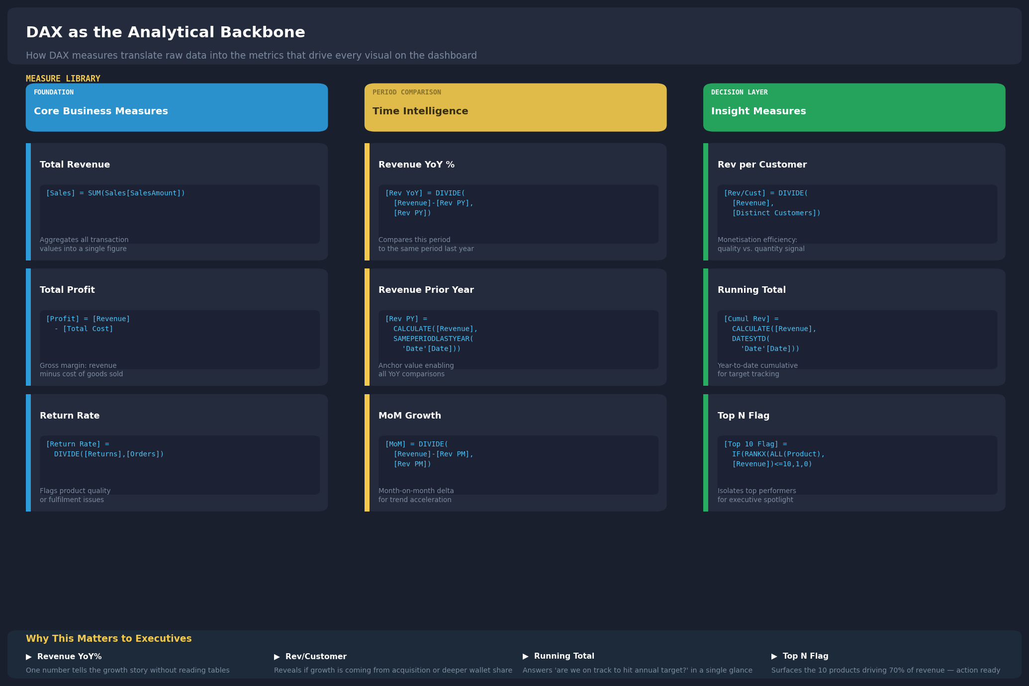
Figure 4 — DAX Measure Library: the three tiers of measures that underpin any well-instrumented dashboard
4. Match the Visual to the Question
Every chart type answers a different question about what to notice first — the wrong one adds a cognitive tax the reader shouldn’t pay.
| The Question Being Asked | Visual That Answers It Most Efficiently |
|---|---|
| How is this metric trending over time? | Line chart slope encodes direction without requiring axis reading |
| How do categories or segments compare? | Sorted horizontal bar — length is among the most accurately read visual encodings |
| Are we on track against a target? | KPI card with conditional colour - binary status, minimal interpretation required |
| What is driving a variance or anomaly? | Decomposition tree - exposes the hierarchy behind a number |
| How is performance distributed by location? | Map visual - geographic pattern visible without reading coordinates |
| Which items account for the majority? | Top N ranked table or bar — precision plus visual confirmation |
5. Remove Everything That Does Not Serve the Reader
Visual clutter is a cognitive problem. Decorative elements, redundant legends, and unnecessary colours consume attention the decision needs.
Both panels hold identical data the difference is the clutter removed, not the information shown.
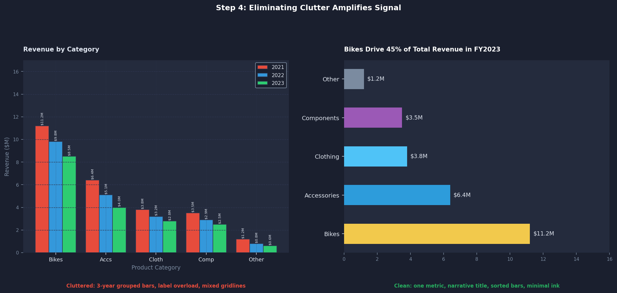
Figure 5 — Identical data, opposite cognitive cost: the sorted bar (right) communicates the
ranking instantly; the grouped chart (left) makes the reader do the designer’s work
Remove 3D effects, reduce colours, delete unnecessary legends, eliminate non-essential gridlines noise down, information intact.
6. Write the Story, Not the Label
Titles should communicate meaning, not just describe what’s displayed — narrative titles guide readers to the insight faster, with less effort.
| Descriptive Title - Avoid | Narrative Title - Use Instead |
|---|---|
| Monthly Performance | Output Has Grown for Six Consecutive Periods- Investigate the December Spike |
| Category Breakdown | Two Categories Drive 70% of Volume- The Rest Require a Strategy Review |
| Customer/User Trend | The Base Is Growing but Value per User Has Declined Three Periods Running |
| Regional/Location View | One Region Outperforms All Others on Efficiency- The Gap Is Widening |
The same logic applies to the dashboard as a whole: every section should end with a direction, not a summary.
Seeing It in Practice
Applied to a real multi-region dataset, this framework surfaced a tension a standard report would miss.
Customer numbers grew year-on-year to over 18,000, but value per customer slid to roughly $1,370 — three consecutive periods of decline, a growing base generating less value per relationship. Tracked as customer count alone, that reads as good news; only the two metrics together expose the tension
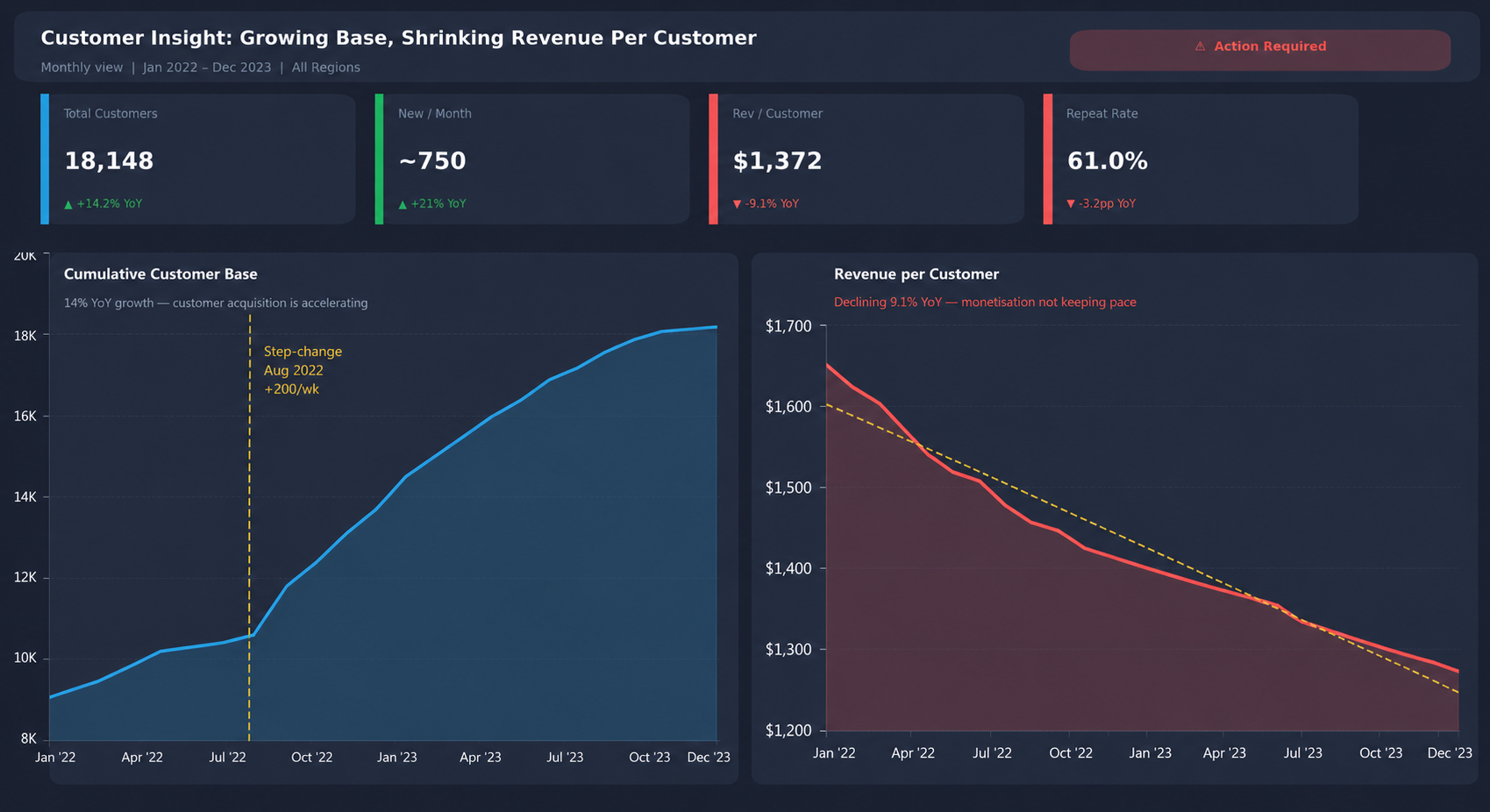
Figure 6 — Volume growth alongside declining per-unit value: neither chart alone is the insight; the tension between them is
The Real Takeaway
A dashboard has done its job when the next question is not “What am I looking at?” but “What should we do about it?” Start with that decision, and everything else—the metrics, context, visuals, and narrative—has a clear purpose. The goal is not to build a dashboard people can read. It is to build one that helps them decide.
Blog Author

Gaurav Patil
Power BI Data Visualization Engineer
Intellify Solutions